My drawing output has been notably lackluster over the last few weeks, but I was looking at some recent sketches and decided they were, if nothing else, worthy of some commentary.
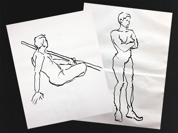
First, there’s a reason the figure drawings above look a little shaky. About a month ago, my art teacher took a spill on the sidewalk and broke her right arm. As she recuperated, she couldn’t fathom not drawing, so she began using her left hand. Upon her return to class, inspired by this experience, she introduced a new exercise: 3-minute poses with our non-dominant hands.
I think what surprised me, and all the other students, was that our drawings were surprisingly accurate. In fact, shakiness aside, my proportions in these left-handed sketches might be better than those in most of my right-handed ones. How could that be?
My theory (disclaimer: despite the pale skin, I am not a scientist) is that when drawing with my dominant hand, I rely too much on memory, muscle and otherwise, and not enough on seeing. It takes a lot of concentration to accurately gauge the contour of a person or object in front of you. When concentration slips, you begin taking shortcuts. Your jerk brain says to your arm, “Okay, head goes here. You’ve drawn SO MANY heads! Piece of cake.” And so you end up drawing a head, but not the head in front of you.
But unless you’re one of those nudniks who brags about being ambidextrous, drawing with your “other” hand is completely different. Your brain has no practical experience in taking shortcuts with this hand. The most practical way to guide your hand clumsily across the page is to let your eyeballs take the lead. Like a human pantograph, you move your gaze over the contour of the object you’re drawing, and move your hand to match.
Of course, there’s a lot more to good drawing than contour, but I think for amateurs like me, it can be the hardest aspect to grasp, because it’s the one part of the process that is diminished by conscious thought. Anatomy, shading, composition–these are all things that are OK to think about. But contour and measuring? It really is best left to your eye and your hand.
Wow, I didn’t think I was going to babble so incessantly about this topic. Your reward for making it this far is another underwhelming sketch!
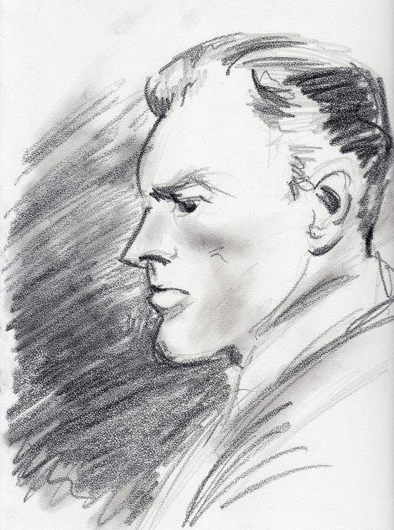
The reason I was unhappy with this sketch is that it was supposed to be a certain celebrity, but it ended up looking nothing like him. Don’t even try to guess. It looks NOTHING like him.
But I can say a couple positive things about it. First, I kinda like this style of drawing and want to explore it further. And I really love the textured paper I drew it on.
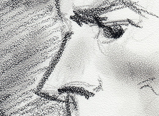
A lot of cartoonists have used this type of paper as an alternative to using halftone dots for shading. Because pencil and even ink is laid down in this coarse speckled pattern, it was perfect for old-school newspaper engraving methods.
Bet you’re glad you stuck around for that bit of trivia. Till next time!