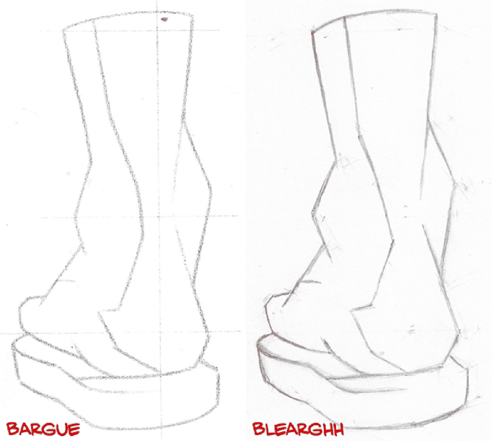
So, somehow this turned out even worse than the first one. What’s interesting is that I plotted a lot more points on this one, triple-checked myself, etc. It was looking pretty good to me until I actually compared it directly.
As I drew this, I wondered if it would be kosher to use a compass instead of a string–seems logical, but I didn’t want to deviate too much from the first write-up I read. But today I came across another very helpful thread on the ConceptArt forums in which an instructor suggests a compass for one of the options, and walks a couple people through the entire process. So I’ll definitely be picking up a compass, so I can avoid the headache of trying to keep a thumbnail in the exact right spot on a slippery piece of thread.
