Going back to some basic animation concepts here; although I feel like I learned something from the 11-second animation contest, I also threw a lot of these basics out the window–I was in a hurry, and I was anxious to see my characters move.
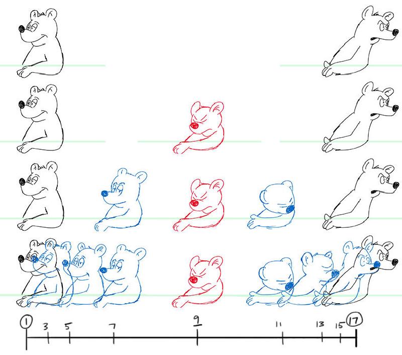
This picture illustrates basic timing and spacing. If I wanted to have Kerkel angrily react to something by turning his head, and have the action take 16 frames from start to finish, I’d begin by drawing the two “extremes,” as indicated in black. Then I’d figure out where I wanted his head to be at the apex of the move, aka the “breakdown,” and draw that next, as indicated in red. Then I’d draw successive inbetweens, as indicated in blue.
The chart at the bottom, as well as the way I’ve arranged the drawings, indicates the “spacing”–how far the character has moved in that particular period of time. Most actions “ease” in and out, which is why the drawings at the beginning and end of the move are closer together, indicating that the move speeds up as it approaches the breakdown, then slows down.
Once I get comfortable with this concept, I can add some realism by using different spacing for different body parts. His ears could take a little longer to settle than his head, for instance.
