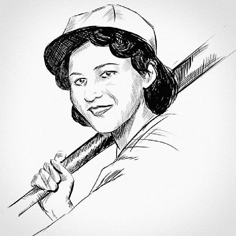
Still obsessed with Gibson; unlike my previous drawing, this one is digital, and it’s a *gasp* tracing of a photo. Right now my focus is getting a handle on that wonderful turn-of-the-century inking style. I’ve always been enamored of the way draughtsmen of those days could churn out drawings that looked precise and loose at the same time, with all gray tones rendered using well-placed chicken scratches.
I think the trick is in getting the balance right. Shading with lines is dicey; If they’re too thick or tightly spaced, they can make a young girl look old or manly–or maybe even hairy. Even when you’re not worried about portraying youth, you might step back from your novice crosshatching and discover that, at arm’s length, what you thought was a light shadow is darker and muddier than you intended.
I think by making shadowed edges and clumps of hair nice and dark and thick, deft hatching will, in contrast, look less like lines and more like shading, as was intended. I’m not saying I got it right here, but by studying old drawings I’m getting closer than I’ve been before.
I think what I’m really missing is the confidence that produces a looser feel, but that, like everything else, takes practice.
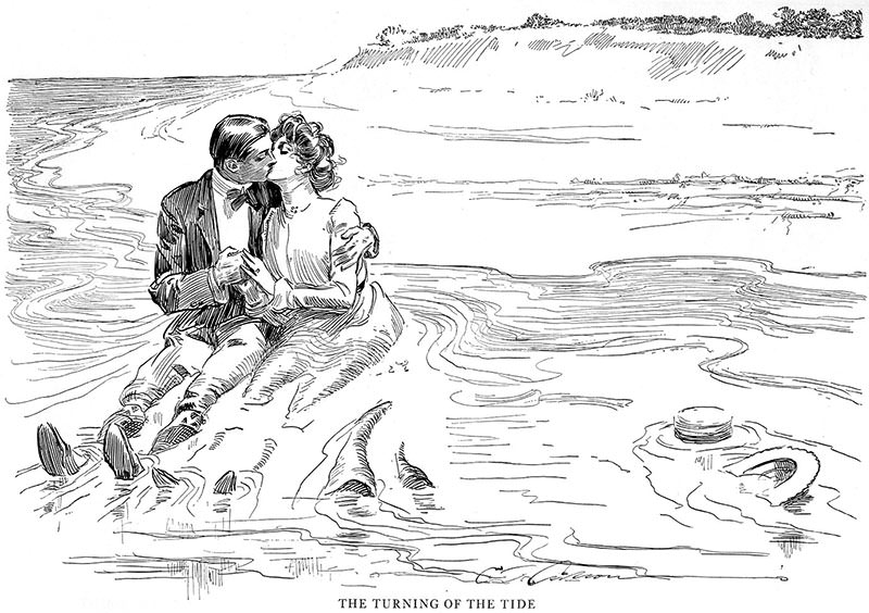
Here’s another Gibson for you to admire:

